Getting Ready
1) Before we make a userbar, we have to get together a few things first. What you need to make the userbar font is the Visitor TT1 BRK font from here. Install the font on your computer.
2) We also need to make the scanlines pattern. To do that open GIMP and make a new image with these settings:

3) Now zoom in 1600% so you can see it. If you can see it without zooming in, then you must have super mega ultra sight. Select the pencil tool
 and pick the Circle 01 brush, 100% opaque. Now draw an image exactly like mine. If it isn't, then you screwed up. It has to be like this or your userbar will turn out weird.
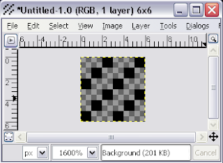
4) Save the image as scanlines.pat in Program Files -> Gimp-2.0 -> share -> gimp -> 2.0-> patterns
5) Exit GIMP. You have to do this so your pattern and Visitor TT1 BRK font are loaded into GIMP.
Making the Userbar
1) Create a new image with these settings.

2) Select a gradient
 that matches the colors of what you want your userbar to be about. Mine is about my blog so I chose a light blue (0090ff)and white (FFFFFF). Hold down the CTRL key and drag the gradient from left to right or right to left. It should be somewhat like this:
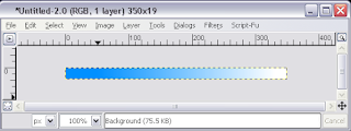
3) Create a new layer, and make it transparent. Name it "scanlines." Now we need to add the scanlines. Select the paintbucket tool
 and in the tool options pick pattern source as the fill type. These are the settings:
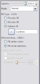
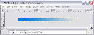
4) In the scanlines layer, apply the paintbucket tool. Decrease the layer's opacity to about 50%. It should look like this:
5)Now create another layer. Name it "logo." Add your picture to this layer and position it on the right. Mine came out like this: (My logo came out horrible...I'll fix it later..)

6) Now we'll add some text. Select the text tool
 and pick the Visitor TT1 BRK font. Font size needs to be 10 and the color needs to be white:
Click on the right side of your userbar and type in something. I put "SGlider12's Blog Reader." Position the text to the right side on the center. Make sure your layers look like mine.


9) Now we'll add the text outline. Select the text layer, right click it, select "Alpha to Selection." Now create a new transparent layer. Name it "outline". Go to Select -> Grow. Grow selection by 1px. Press Ok. Now select the paintbucket tool
 . Choose foreground color as fill type. Set the foreground color to black. Fill in the outline layer with it still selected. If you fill the whole layer with black, then you once again screwed up. Move the outline layer underneath the text layer. It should look like this:
10) Now we'll add the shiny part. Create a new transparent layer and name it "eclipse." Select the circle select tool
 and select the upper part of the userbar like this:
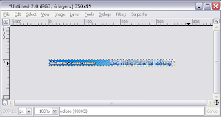
Fill the selection with white using the paintbucket tool. Now change the layer's opacity to about 50% and deselect it.

11) Last, we'll add the border. Create a new transparent layer and name it "border." Put the border layer on top of the other layers. Put black as your foreground color. Select -> All. Go to Edit -> Stroke Selection. Put a value of 1. Press Ok.
Final Result:

Now go show it off to the world.

great...
ReplyDeletethank for the tutorials...
Nice tut. <3
ReplyDeleteHere's my outcome: http://www.ponyisland.org/img/gallery/250821.png