You know those iPod commercials where the people are black and the earbuds are white and they are dancing and such? Well, I had this crazy idea, literally two seconds ago.
I decided, hey, why not make a tut for all to see about how to make the little dancers with white earbuds in Gimp? So I did.
EDIT: Video iPod Dancer Follow-Up
1) Get a picture of someone dancing. It doesn't matter who. Anyone. I got mine from GettyImages:
2) Open your image in Gimp. If you want, you can clear out that logo if you got it from a stock website. Also do some housekeeping, such as making the background one color, cleaning up anything fuzzy, etc.
3) Create a new transparent layer. Name it "Black." Click the paths tool. Make sure in the toolbox, the paths tool is in Design Mode and polygonal is unchecked. Now, start outlining your dancer with the paths tool. When you get to the end, hold down CTRL and click on the beginning dot. It should look somewhat like mine:
3) Now click on the "Selection from Path" button. You should now have a selection around your dancer. Click on the Paintbucket Tool, and, with black as your foreground color, fill the selection. It should fill your dancer completely black. Now you can go around a clean up the edges a little if they're not smooth or some of the original picture is showing. It should look like mine:
So now it looks like we're getting somewhere. Now we'll make the background, so the earbuds will show up. You can delete the original image now.
4) Create a new white background layer. Drag it under your black layer. Pick a color for your background. I'm using a green one that I've seen in the commercials. Apply it to the white background layer.
Now we will add the earbuds...yay!
5) Select the paths tool. Zoom in on the ear and draw the shape of an earbud. Fill it with white.
6) Now, using the paths tool, draw an iPod in his hand. Here's mine (yes, I know my iPod is smaller than it should be):
If you want, you can draw fingers and thumbs to the hand to make it look like he is holding the iPod.
7) Use the paths tool again to draw the cord. Instead of clicking selection from path, this time you will click stroke path. Experiment with the boldness of the line.
And now for some final touches:
Now you have an iPod dancer. Have fun.
EDIT: Video iPod Dancer Tutorial Follow-Up
December 6, 2007
December 5, 2007
130 Web 2.0 Gradients for GIMP
Here are those gradients I converted:
http://gimp-tutorials.net/130-UltimateWeb20-Gradients-for-Gimp
Digg It Here:
http://digg.com/design/The_complete_130_Ultimate_Web_2_0_Gradients_for_Gimp/
Yay!
http://gimp-tutorials.net/130-UltimateWeb20-Gradients-for-Gimp
Digg It Here:
http://digg.com/design/The_complete_130_Ultimate_Web_2_0_Gradients_for_Gimp/
Yay!
December 4, 2007
Convert Photoshop Layer Styles to Gimp Gradients
Alright, so I was browsing the forums at Gimper.net and Gimper asked in a post to convert the rest of these Photoshop Layer styles to Gimp gradients...all 130 of them. So I said I would and I did. These are the original layer styles by dezinerfolio:
These are the 30 Gimper converted:
So now, here's a tutorial on how to convert gradients.
Here are the layer styles I downloaded, scroll down a bit to find the download link: http://www.dezinerfolio.com/2007/05/06/ultimate-web-20-layer-styles/
You will also need Photoshop (I used CS3 but it doesn't really matter what version you use..) and you will also need Gimp.
First, I will show you how to make the regular, two colored gradients, like this:
Open Photoshop. Make a new image. Any size will do. I used 300x300 pixels, but it doesn't really matter. Select the Custom Shape Tool. Now select the black rectangle shape and click and drag it to a reasonable size on your canvas. Now select one of your layer styles by going here: and pick one similar to the one we are working with. Your shape should take on the layer style you selected:
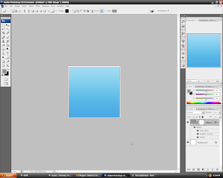
Now you can easily view your layer style. Now open Gimp. Don't start a new image. Instead, go to File -> Dialogs -> Gradients. Click on the new gradient button. You are represented with this screen:
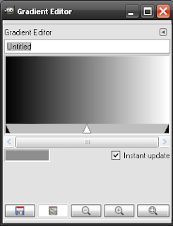
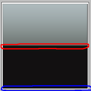
Name the gradient whatever you like. For the purposes of this tutorial, I will name mine Gradient 1. Now go back to Photoshop. Select the eyedropper tool. With the eyedropper tool, select a color furthermost to the top of the image, circled in red, for the foreground. Then select a color furthermost to the bottom of the image, circled in blue, for the background. Try not to select part of the stroke on your gradient. It'll mess you up.
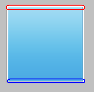
Click on the foreground color box. A Foreground Color Picker should pop up. Copy the 6 numbers (HTML notation) in the # box . Go back to Gimp. Right click on the bottom bar (section) and select Left Endpoints Color. Paste the HTML notation in the HTML notation box. Press Ok. The left color on your gradient should be your foreground color from Photoshop.
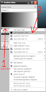
You should now have something like this (although your left color may not be the same):
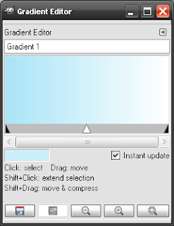
Now for the right color. Go back to Photoshop and open up the Background Color Picker by clicking on the background color box. Copy the HTML notation once again. Go back into Gimp and right click on the bottom bar again. Then click on Right Endpoints Color. Paste the HTML notation into the HTML Notation box. Press Ok. You should now have something like this:
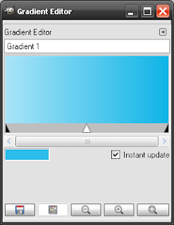
Now we're done with this type of gradient. Save it. The other two types that come with the layer style pack are glossy and flat. The flats consist of one color so we don't really need to go over those. I will now show you the glossy kind, like this:
Go back to Photoshop. Click on the Custom Shape Tool , and then select a new layer style here: and pick one similar to the one we are working with.
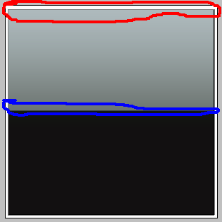
Now, these gradients are a bit different. Selecting the colors are different here. First, select a color near the top for our foreground color. Then, select one near the middle, which would be just above the black in my gradient.
Go back to the Gradients dialog in Gimp. Click the new gradient button. First thing we have to do is right click on the bottom bar then click on Replicate Segment..
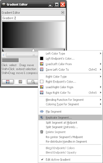
In the Replicate Segment dialog, slide the slider to 2, and press Ok. Your gradient should now look like this:
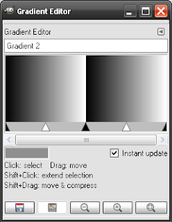
Go back to Photoshop and click on the foreground color box. It should be the color of the top of your layer style. Copy the HTML Notation.
Now, back in Gimp in the Gradient Editor, left click on the left bar, between the two black triangles. The left bar should now be grey, with the right bar as white.
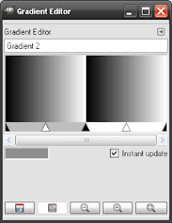
Now right click on the left bar. Then click on Left Endpoint's Color button. Paste the HTML notation in the HTML notation box. Press Ok. The very left color should now be like mine or similar:
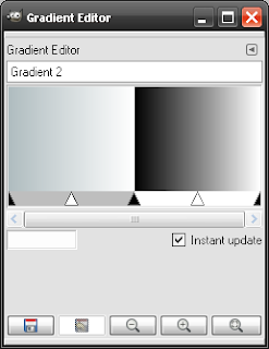
Go back to Photoshop, and click on the background color box. Copy the HTML notation. Go back to Gimp, right click on the left bar again, and select the Right Endpoint's Color option. Paste the HTML notation. Click Ok. It should be similar to mine:
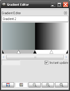
Now, left click on the right bar. The left bar should be white now and the right bar should now be grey. Go back to Photoshop. For your foreground color, select a color near the top of the middle, which would be in the black, not in the grey of my image, circled in red, and for the background, select a color near the bottom, circled in blue.
Now click on the foreground color box. Copy the HTML notation. Go back to Gimp. Right click on the right bar, and select the Left Endpoint's Color option. Paste the HTML. Click Ok. Go back to Photoshop, click on the background color box. Copy the HTML. Go back to Gimp. Right click on the right bar, and select the Right Endpoint's Color option. Paste the HTML. Click Ok. It should now be similar to mine:
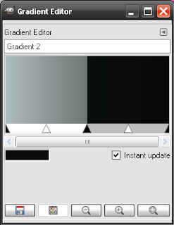
Now we're done. Save it and there you go. I haven't figured out how to get that stroke of color on there that seems to border the gradient. It's probably something that'll have to be manually added to your image if you want it. That's the tutorial.
November 26, 2007
The Gimp 2.4
On the 11th, GIMP 2.4.2 was officially released (so yeah, this is kinda late), but anyway, there are a lot of new features with this one. Download here. The release notes can be found here.
The interface is a little different, "a refreshed look."
Brushes are now scalable. I look forward to that one.
The selection tools have been completely rebuilt, allowing you to resize existing selections, and more. There is a new foreground select tool. It is used in two steps: 1) You select a region of interest that contains the entire object, then 2) you paint over the selected area with a brush, not crossing the object's border. Yeah, that description confuses me, too. Don't blame me, I got it from their release notes. There's a video tutorial you can watch, too, about this tool (Just click on the release notes link above).
Easier alignment is now possible with a new alignment tool, improved display when zooming in or out, and support for new file formats like:
I'll be trying these out soon. Link.
The interface is a little different, "a refreshed look."
Brushes are now scalable. I look forward to that one.
The selection tools have been completely rebuilt, allowing you to resize existing selections, and more. There is a new foreground select tool. It is used in two steps: 1) You select a region of interest that contains the entire object, then 2) you paint over the selected area with a brush, not crossing the object's border. Yeah, that description confuses me, too. Don't blame me, I got it from their release notes. There's a video tutorial you can watch, too, about this tool (Just click on the release notes link above).
Easier alignment is now possible with a new alignment tool, improved display when zooming in or out, and support for new file formats like:
- Photoshop ABR Brushes (I LOVE this one!)
- Improved reading/writing EXIF in JPEG
- Importing clipping paths in TIFF
- Layer masks can be saved to PSD (nice)
- 16/32 bit bitmaps alpha-channel support in BMP
- 24 bit and Vista icons can be opened and saved (schweet)
I'll be trying these out soon. Link.
October 2, 2007
Userbar How To
I have finally decided to show you how to make userbars today. I make a lot of them which you can see at my dA...you'll have too look for them in my gallery. Note: You can click on the images to make them bigger.
Getting Ready
1) Before we make a userbar, we have to get together a few things first. What you need to make the userbar font is the Visitor TT1 BRK font from here. Install the font on your computer.
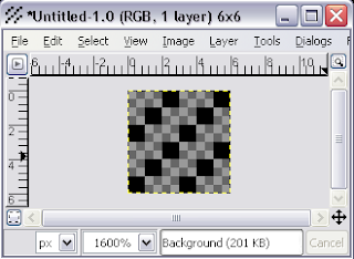
2) We also need to make the scanlines pattern. To do that open GIMP and make a new image with these settings:
3) Now zoom in 1600% so you can see it. If you can see it without zooming in, then you must have super mega ultra sight. Select the pencil tool and pick the Circle 01 brush, 100% opaque. Now draw an image exactly like mine. If it isn't, then you screwed up. It has to be like this or your userbar will turn out weird.
4) Save the image as scanlines.pat in Program Files -> Gimp-2.0 -> share -> gimp -> 2.0-> patterns
5) Exit GIMP. You have to do this so your pattern and Visitor TT1 BRK font are loaded into GIMP.
Making the Userbar
1) Create a new image with these settings.
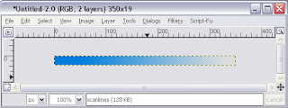
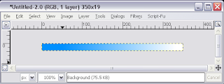
2) Select a gradient that matches the colors of what you want your userbar to be about. Mine is about my blog so I chose a light blue (0090ff)and white (FFFFFF). Hold down the CTRL key and drag the gradient from left to right or right to left. It should be somewhat like this:
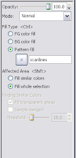
3) Create a new layer, and make it transparent. Name it "scanlines." Now we need to add the scanlines. Select the paintbucket tool and in the tool options pick pattern source as the fill type. These are the settings:
4) In the scanlines layer, apply the paintbucket tool. Decrease the layer's opacity to about 50%. It should look like this:
5)Now create another layer. Name it "logo." Add your picture to this layer and position it on the right. Mine came out like this: (My logo came out horrible...I'll fix it later..)
6) Now we'll add some text. Select the text tool and pick the Visitor TT1 BRK font. Font size needs to be 10 and the color needs to be white:
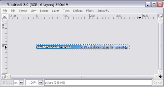
Click on the right side of your userbar and type in something. I put "SGlider12's Blog Reader." Position the text to the right side on the center. Make sure your layers look like mine.
9) Now we'll add the text outline. Select the text layer, right click it, select "Alpha to Selection." Now create a new transparent layer. Name it "outline". Go to Select -> Grow. Grow selection by 1px. Press Ok. Now select the paintbucket tool. Choose foreground color as fill type. Set the foreground color to black. Fill in the outline layer with it still selected. If you fill the whole layer with black, then you once again screwed up. Move the outline layer underneath the text layer. It should look like this:
10) Now we'll add the shiny part. Create a new transparent layer and name it "eclipse." Select the circle select tool and select the upper part of the userbar like this:
Fill the selection with white using the paintbucket tool. Now change the layer's opacity to about 50% and deselect it.
11) Last, we'll add the border. Create a new transparent layer and name it "border." Put the border layer on top of the other layers. Put black as your foreground color. Select -> All. Go to Edit -> Stroke Selection. Put a value of 1. Press Ok.
Final Result:
Now go show it off to the world.
Subscribe to:
Posts (Atom)