Alright, so a couple of weeks ago I stumbled upon Gimp Portable 2.4.4. I've been using Gimp 2.2.1.7 Portable for sometime on my flash drive at school, but it wasn't as flexible as the newer one, so yeah I'm glad they finally updated it. :D
Click here to get Gimp Portable 2.4.4
Try it out.

February 20, 2008


February 10, 2008
February 9, 2008
iPod Dancer Video Tutorial
I didn't realize how popular my iPod Dancer Tutorial would get, so I decided to make a video tutorial of it. Here:
EDIT: The high res video has been removed. It went missing from my MediaFire account. Sorry :)
EDIT: The high res video has been removed. It went missing from my MediaFire account. Sorry :)
February 2, 2008
Web 2.0 Website Links
Ok, so these are the little web 2.0 style links for webpages. I decided to do a tutorial on these because I needed some custom ones, and thought I'd share. Aren't I the nicest person?? :P
Ok, before we start, we need to get the font. I'll use the userbar font that I introduced you to a while back in my userbar tutorial. Get it here.
1) Ok, so open Gimp. Create a new image that's 80x15 pixels with a white background.
2) Create a new layer. Change the foreground color to something that you would like for the border. Go to Select -> All. Go to Edit -> Stroke Selection. Select 1px thick, and solid line. Stoke the selection. Select -> None. Note, you won't be able to see the stroke because it is being covered by the yellow and black dashed lines. Don't worry though, it's there.
3) Now we will add text. Type in what you like. For my case, I will type "Gimp Google" but without the quotes. Make sure the font is Visitor TT1 BRK. The font size should be about 10-14. Adjust the color and positioning to the right.
4) I decided to put a logo in mine, so I scaled it down to where it would fit, toward the left.
5) Now we will add the background coloring. The reason we do this last is because our fonts and/or logos guide this step. Create a new layer above the background layer. Using the select tool, select an area that surrounds the text, but is one pixel shy of touching the border. Fill it with the same color as your border. Do the same around the logo.
6) We're done!

Please note...mine SUCKS!!
But it's ok..at least you know how to do it now. :P
Ok, before we start, we need to get the font. I'll use the userbar font that I introduced you to a while back in my userbar tutorial. Get it here.
1) Ok, so open Gimp. Create a new image that's 80x15 pixels with a white background.
2) Create a new layer. Change the foreground color to something that you would like for the border. Go to Select -> All. Go to Edit -> Stroke Selection. Select 1px thick, and solid line. Stoke the selection. Select -> None. Note, you won't be able to see the stroke because it is being covered by the yellow and black dashed lines. Don't worry though, it's there.
3) Now we will add text. Type in what you like. For my case, I will type "Gimp Google" but without the quotes. Make sure the font is Visitor TT1 BRK. The font size should be about 10-14. Adjust the color and positioning to the right.
4) I decided to put a logo in mine, so I scaled it down to where it would fit, toward the left.
5) Now we will add the background coloring. The reason we do this last is because our fonts and/or logos guide this step. Create a new layer above the background layer. Using the select tool, select an area that surrounds the text, but is one pixel shy of touching the border. Fill it with the same color as your border. Do the same around the logo.
6) We're done!

Please note...mine SUCKS!!
But it's ok..at least you know how to do it now. :P
January 22, 2008
Smiley Tutorial
Ooh, two tutorials in two days. I'm on a role...hehe...
Anyway, today I'm going to teach you how to make smilies in Gimp. This is a very easy tutorial.
1) Create a new 19x19 transparent image.
2) Zoom in to about 800%. Click the ellipse select tool . Create a circle that fills up the entire space. Fill it with a dark yellow.
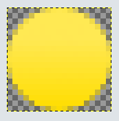
3) Now select the gradient tool with the selection still activated. Select a lighter yellow as your foreground color. Now, in the gradients dialog, select FG to Transparent. Drag the gradient from the top to the bottom. You should have something like this (note I am zoomed to 800%):
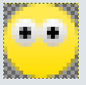
4) Create a new layer. Select the ellipse tool again. Select an area about the size of an eye. Fill it with a semi-dark shade of gray. Again with the gradient tool, and white as your foreground color, drag the gradient tool from top to bottom. Shrink the selection by one pixel and fill it with black for the pupil. Do this again for the second eye. You should have something like this:
5) Now for the mouth. Create a new layer. Select the paths tool . Create an area about the shape of an open, smiling mouth. Move the points and the lines to get the shape you want. Once you have it, click the "Path to Selection" button. Your path should have changed to a selection. Fill it with a dark red. Then shrink the selection one pixel. Fill it with a darker red or black. Deselect. Zoom out to 100%. You should have something like this:

There you go! A smiling smiley!
Anyway, today I'm going to teach you how to make smilies in Gimp. This is a very easy tutorial.
1) Create a new 19x19 transparent image.
2) Zoom in to about 800%. Click the ellipse select tool
 . Create a circle that fills up the entire space. Fill it with a dark yellow.
3) Now select the gradient tool
 with the selection still activated. Select a lighter yellow as your foreground color. Now, in the gradients dialog, select FG to Transparent. Drag the gradient from the top to the bottom. You should have something like this (note I am zoomed to 800%):
4) Create a new layer. Select the ellipse tool again. Select an area about the size of an eye. Fill it with a semi-dark shade of gray. Again with the gradient tool, and white as your foreground color, drag the gradient tool from top to bottom. Shrink the selection by one pixel and fill it with black for the pupil. Do this again for the second eye. You should have something like this:

5) Now for the mouth. Create a new layer. Select the paths tool
 . Create an area about the shape of an open, smiling mouth. Move the points and the lines to get the shape you want. Once you have it, click the "Path to Selection" button. Your path should have changed to a selection. Fill it with a dark red. Then shrink the selection one pixel. Fill it with a darker red or black. Deselect. Zoom out to 100%. You should have something like this:
There you go! A smiling smiley!
January 21, 2008
Web 2.0 Badges
Today I will be teaching you how to make Web 2.0 badges in Gimp. Pretty simple to catch on I must say.
1) Create a new image that is 300x300, white background.
2) Add a new layer. Select the ellipse select tool. Select an area that nearly fills up the canvas.
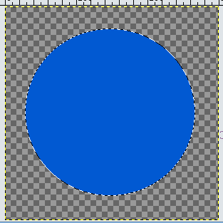
3) Now we want our border color. Select color 0159d2 and fill the circle with it using the paint bucket tool . Do not deselect yet. You should have something like this:
4) With the circle still selected, create a new layer. Go to Select -> Shrink. Shrink the selection by two pixels. Press D to reset your foreground and background colors. Press X to switch them. White should be in front.
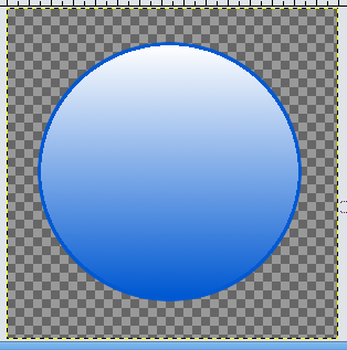
5) Click the gradient tool. In the gradients menu, select FG to Transparent. Fill the selection with the gradient by dragging it from top to bottom. Hold the CTRL button while you do it to keep the line straight. You should have something like this:
6) Now we will add some text. Add the text toward the center with white font. Position it somewhere in the center. Merge the text layer down with the rest of the badge.
7) Now we will create a reflection on the badge. Click the ellipse select tool. Select somewhere toward the top left corner of the badge. Then, click the magic wand tool. Put it in subtract mode, and, with the badges layer selected, select the empty space. This should leave just part of the badge selected:
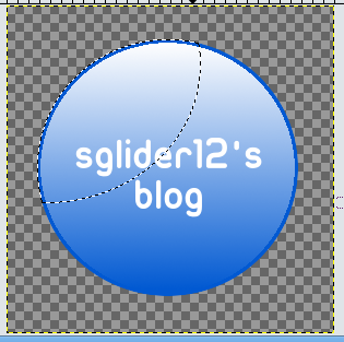
8) Now, create a new layer. Fill the selection with white. Lower the opacity to about 33. Merge the layers.
9) Select the layer the badge is on. Go to Filters -> Light and Shadow -> Drop Shadow. Set the offsets to zero, the blur radius to 10. Uncheck allow resizing. Raise opacity to about 85.
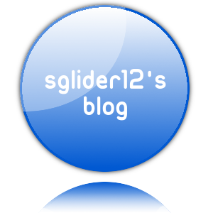
10) Select the layer that the badge is on. In the layers dialog, click the duplicate layers button. You should now have two badges. Select the duplicated layer. Go to Layer -> Transform -> Flip Vertically. Move the flipped layer under the original layer. Now you can merge the original badge layer with the drop shadow layer.
11) Right click on the flipped badge's layer in the layers dialog and select Alpha to Selection. Select the gradient tool. Choose FG to Transparent. Make sure white is in the foreground. Drag the gradient tool from bottom to top. There you have it! A basic web 2.0 badge.
1) Create a new image that is 300x300, white background.
2) Add a new layer. Select the ellipse select tool
. Select an area that nearly fills up the canvas.3) Now we want our border color. Select color 0159d2 and fill the circle with it using the paint bucket tool
 . Do not deselect yet. You should have something like this:
4) With the circle still selected, create a new layer. Go to Select -> Shrink. Shrink the selection by two pixels. Press D to reset your foreground and background colors. Press X to switch them. White should be in front.
5) Click the gradient tool
. In the gradients menu, select FG to Transparent. Fill the selection with the gradient by dragging it from top to bottom. Hold the CTRL button while you do it to keep the line straight. You should have something like this:
6) Now we will add some text. Add the text toward the center with white font. Position it somewhere in the center. Merge the text layer down with the rest of the badge.
7) Now we will create a reflection on the badge. Click the ellipse select tool. Select somewhere toward the top left corner of the badge. Then, click the magic wand tool. Put it in subtract mode, and, with the badges layer selected, select the empty space. This should leave just part of the badge selected:

8) Now, create a new layer. Fill the selection with white. Lower the opacity to about 33. Merge the layers.
9) Select the layer the badge is on. Go to Filters -> Light and Shadow -> Drop Shadow. Set the offsets to zero, the blur radius to 10. Uncheck allow resizing. Raise opacity to about 85.
10) Select the layer that the badge is on. In the layers dialog, click the duplicate layers button. You should now have two badges. Select the duplicated layer. Go to Layer -> Transform -> Flip Vertically. Move the flipped layer under the original layer. Now you can merge the original badge layer with the drop shadow layer.
11) Right click on the flipped badge's layer in the layers dialog and select Alpha to Selection. Select the gradient tool. Choose FG to Transparent. Make sure white is in the foreground. Drag the gradient tool from bottom to top. There you have it! A basic web 2.0 badge.

January 6, 2008
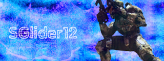
Sigs in Gimp
I've seen a lot of tutorials like this on how to make sigs in Gimp. I thought I would make my own, too.
1) First, we need to make a background. I am going to make a grunge style background based on the tutorial from GimpTalk. First, you need to get some grunge brushes in order to do this. Go to DeviantArt.com and search for grunge gimp brushes or just Google some. Now, create a new image, 400x150, with a white background. Create a new layer, name it grunge. Brush your grunge brushes on it with a black color. Completely cover the layer.
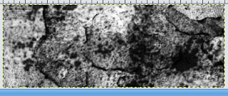
2) Now, go to Colors -> Color Balance. Change the color balance of the grunge layer to something that suits your needs. You can also go to Colors -> Colorize and change the colors from there.
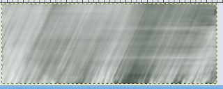
3) Do a motion blur. Go to Filters -> Blur -> Motion Blur. Blur Type: Linear, Length:121, Angle:115.
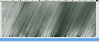
4) Create a new layer. Now use your grunge brushes in white on the layer. Do a motion blur on the layer again. Linear, 160, 0. Lower the opacity to about 60.
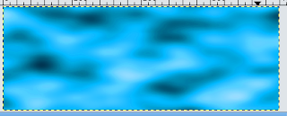
5) Create a new layer, name it clouds. Go to Filter -> Render -> Clouds -> Solid Noise. Leave the settings as they are. Now go to Colors -> Color Balance. Play around with the settings until you come up with something you like.
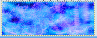
6) Create a new layer. Paint your grunge brushes on this layer in black. Fill up the layer but don't get too dark. When you're done, change the layer mode to Overlay. Create another layer and paint your grunge brushes in white. Set the mode to Overlay. Repeat steps one and two as many times as you want but don't use too dark of colors. Then, use the color balance again.
7) Alright, now that you have a background, you need a render. Go to PlanetRenders.net or Google one. Add your new render to your sig. Position it toward the left or somewhere you like it. What I did with mine was after I positioned it, I made it about 80% opaque, duplicated the layer, then set that layer to overlay.
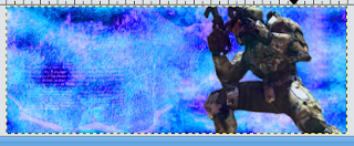
8) Now, we need to add some text. Position it towards the right. I lowered the opacity on the text, then duplicated the layer, setting the second layer to overlay. There you go. A simple way to make sigs.
1) First, we need to make a background. I am going to make a grunge style background based on the tutorial from GimpTalk. First, you need to get some grunge brushes in order to do this. Go to DeviantArt.com and search for grunge gimp brushes or just Google some. Now, create a new image, 400x150, with a white background. Create a new layer, name it grunge. Brush your grunge brushes on it with a black color. Completely cover the layer.

2) Now, go to Colors -> Color Balance. Change the color balance of the grunge layer to something that suits your needs. You can also go to Colors -> Colorize and change the colors from there.
3) Do a motion blur. Go to Filters -> Blur -> Motion Blur. Blur Type: Linear, Length:121, Angle:115.

4) Create a new layer. Now use your grunge brushes in white on the layer. Do a motion blur on the layer again. Linear, 160, 0. Lower the opacity to about 60.

5) Create a new layer, name it clouds. Go to Filter -> Render -> Clouds -> Solid Noise. Leave the settings as they are. Now go to Colors -> Color Balance. Play around with the settings until you come up with something you like.

6) Create a new layer. Paint your grunge brushes on this layer in black. Fill up the layer but don't get too dark. When you're done, change the layer mode to Overlay. Create another layer and paint your grunge brushes in white. Set the mode to Overlay. Repeat steps one and two as many times as you want but don't use too dark of colors. Then, use the color balance again.

7) Alright, now that you have a background, you need a render. Go to PlanetRenders.net or Google one. Add your new render to your sig. Position it toward the left or somewhere you like it. What I did with mine was after I positioned it, I made it about 80% opaque, duplicated the layer, then set that layer to overlay.

8) Now, we need to add some text. Position it towards the right. I lowered the opacity on the text, then duplicated the layer, setting the second layer to overlay. There you go. A simple way to make sigs.

Subscribe to:
Posts (Atom)